QUENELLE ICE CREAM
Brick & Mortar Website
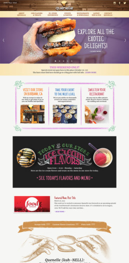
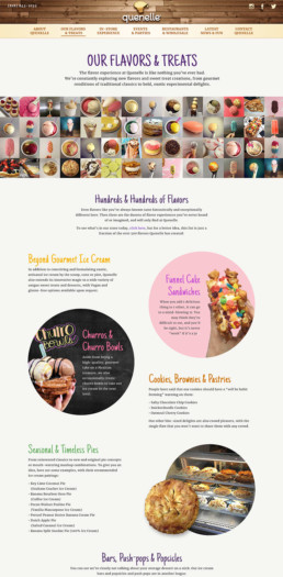
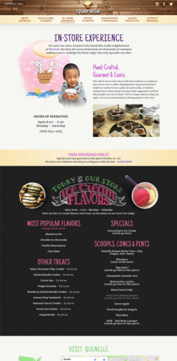
The client needed a design that not only showcased their products, but also conveyed their fun spirit and unique creativity, as well as providing them with an easy CMS for updating their ever-changing sweet offerings.


