H.B. Fuller
H.B. FULLER
Enterprise Website Design
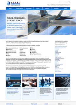
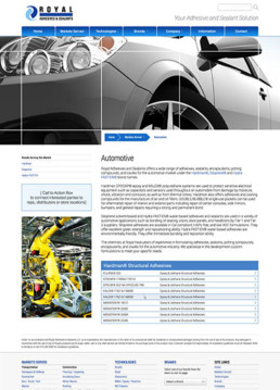
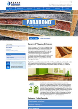
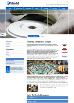
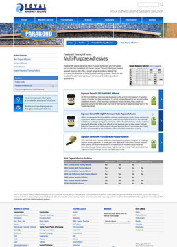
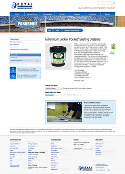
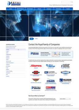
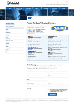
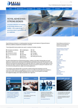
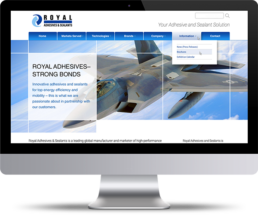
The client needed a new web presence that could encompass over 20 subsidiary brands in the Royal family of companies. Operating globally, the site had to be world-class and present each brand intuitively, with all of their product and technical information, and create a clear route to each of its independent sales forces.
H. B. Fuller
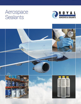
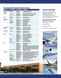
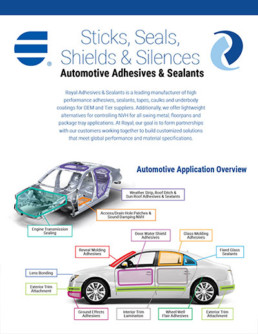
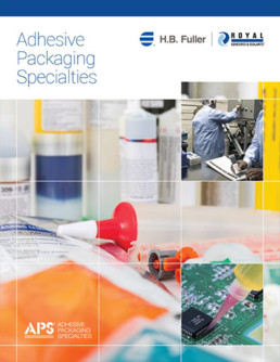
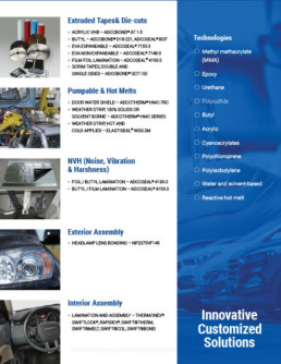
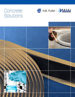
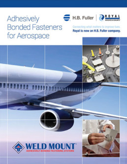
Subsidiary Brand Product Guides
The client needed new sales materials across several subsidiary companies. In addition to updating the information, improving the photography and design, they all needed to be given one cohesive look and feel.
ROYAL ADHESIVES
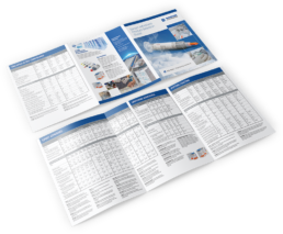
Technical Data Sheets
The client had thousands of technical and safety data sheets for their vast array of products, scattered over 20 different subsidiary manufacturers. They needed a unified format designed that was consistent with the brand and worked for each company's specific requirements. This was a meticulous process of production with proofing and data verification.
Fulcrum Reliability Systems
FULCRUM RELIABILITY SYSTEMS
Website Design & Development
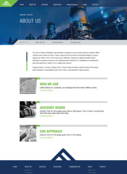
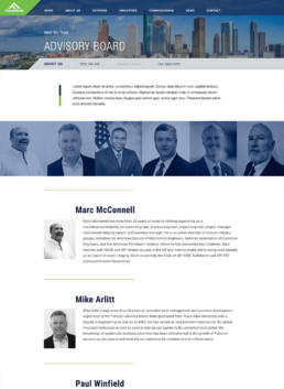
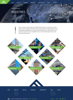
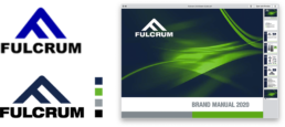
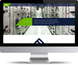
Design and development of a scalable website for a fast-growing business that quickly needed a professional brand and presence for the large contracts it was negotiating and closing with global super brands.

Quenelle Ice Cream
QUENELLE ICE CREAM
Brick & Mortar Website
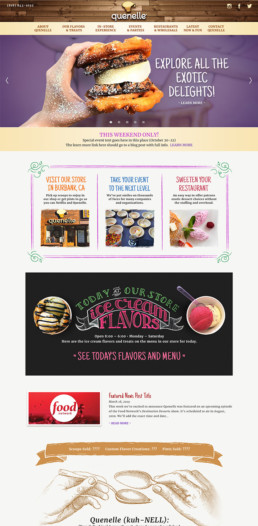
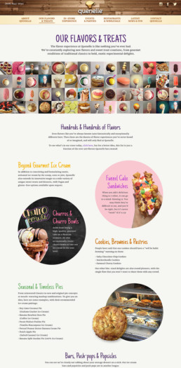
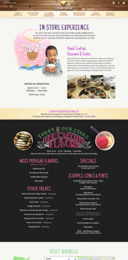
The client needed a design that not only showcased their products, but also conveyed their fun spirit and unique creativity, as well as providing them with an easy CMS for updating their ever-changing sweet offerings.
IntelliQlik
INTELLIQLIK
Hybrid Branding
IntelliQlik was purchased and absorbed into GSE Solutions, a publically-traded global enterprise in the energy industry. We had designed the IntellQlik brand, but now needed to blend the two brands.

INTELLIQLIK
Website Design
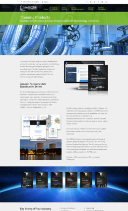
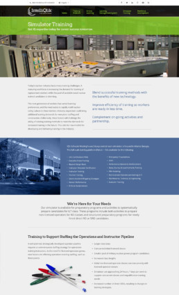
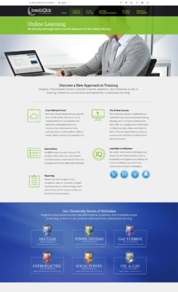
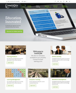
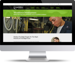
A completely fresh web presence was needed for the recently-acquired company, which needed to operate as a partnered but independent brand.
INTELLIQLIK
Trade Show & Printed Materials
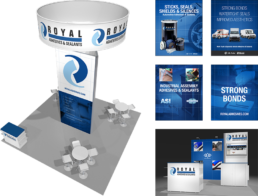
Both IntelliQlik and GSE needed to make a big impression at the largest energy industry trade show,where major deals are made and reputations are formed or reshaped.

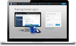
NUCLEAR UNIVERSITY
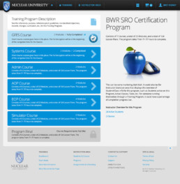
e-Learning System
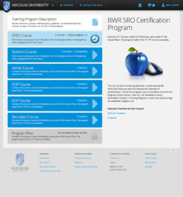
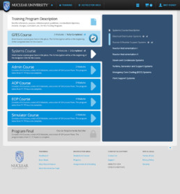
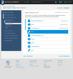
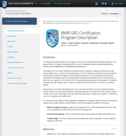
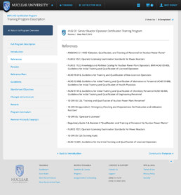
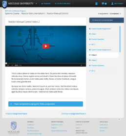
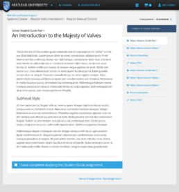
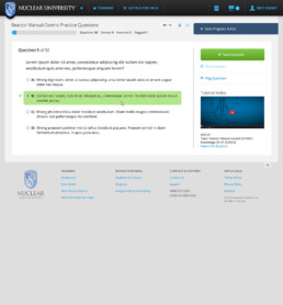
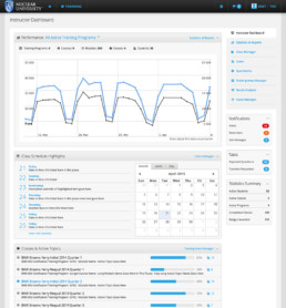
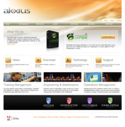
A full-scale online learning and training management solution for the energy industry. Work included branding, concepting, architecting, naming, copywriting, wireframing, iconography, page layouts, navigation sets, modules, etc. This encompassed the front-end website, the e-learning and testing functions, as well as backend admin and user management, for trainers and students.
Natren Probiotics
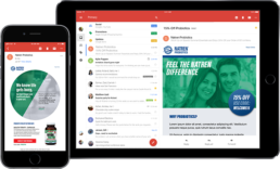
NATREN PROBIOTICS
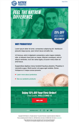
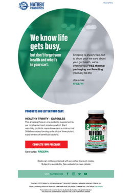
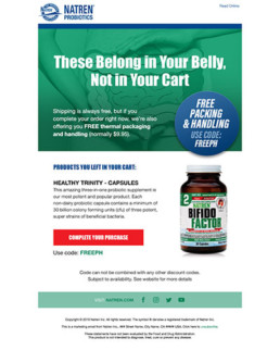
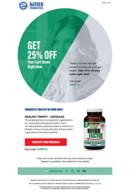
Email Drip & Cart Abandonment Templates
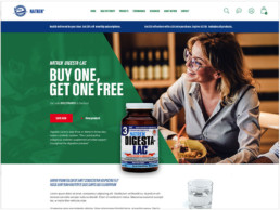
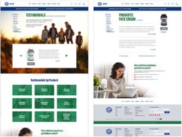
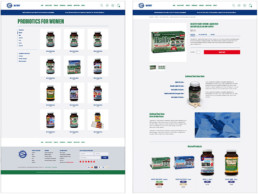
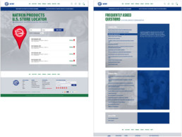
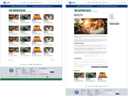
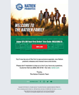
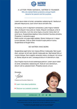
Continuing to support the client's agency, we designed a series of email templates for introductory followup emails, special sales, as well as prompts for customers to return to their carts.
Discovery Music Source
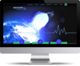
DISCOVERY MUSIC SOURCE
Website Design, Development & Backend
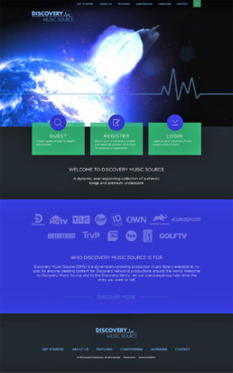
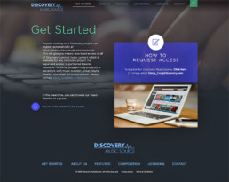
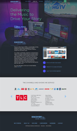
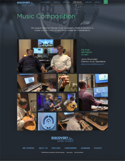
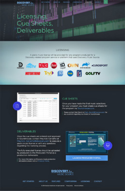
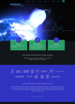
The client is responsible for the music services and asset management for the Discovery Channel's family of stations: TLC, Animal Planet, HGTV, Food Network, and more. Their website needed to be a visually stunning face to a backend system for the staff of all the divisions.
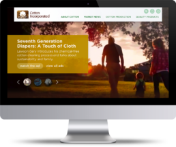
Cotton Incorporated
COTTON INCORPORATED
Enterprise Website Design
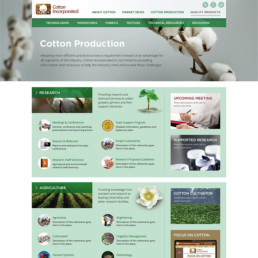
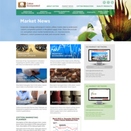
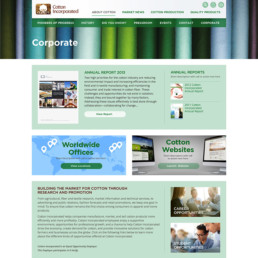
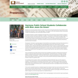
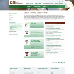
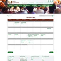
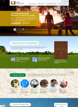
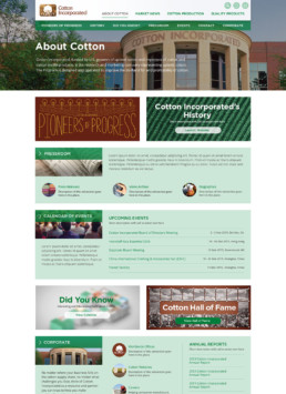
A restructuring and redesign of their existing website, consisting of thousands of pages divided into several sections and a deep scheme of subsections, with all page types, contextual navigation, modules and snippets for their content management solution.
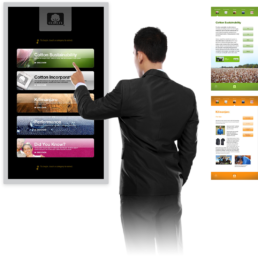
COTTON INCORPORATED
Interactive Touchscreen
A large, portable digital display for trade shows and conferences, including an attractive menu, with easy-to-navigate sections, articles and videos, all at the touch of a finger.
COTTON INCORPORATED
The Fabric of Our Lives Website
Complete redesign of the consumer-facing marketing website The Fabric of Our Lives. The project required reconceiving site hierarchy, navigation, page themes and segments for the client’s content management solution and pre-existing web-based apps.

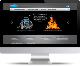
Bobrick
BOBRICK WASHROOM EQUIPMENT INC.
Enterprise Website Design
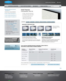
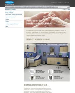
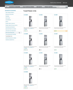
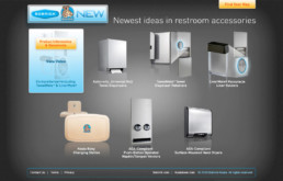
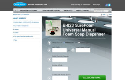
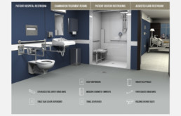
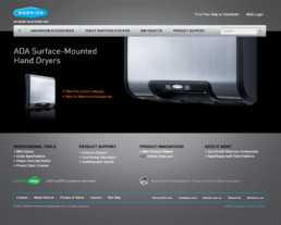
Bobrick is a 100+-year-old global washroom accessory and partition company with six manufacturing divisions across the United States and Canada. They needed a new design for their enterprise-class website, consisting of hundreds of products, warranties, installation guides, forms, and marketing information; all of which needed to be incorporated into a custom content management solution that connected to their intranet and inventory solutions.
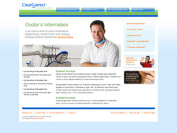
ClearCorrect
CLEARCORRECT
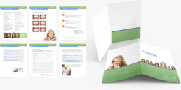
Doctor & Patient Sales Materials
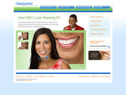
As a new brand in the orthodontics industry, the client needed marketing materials that made their treatment program look trustworthy and fully-established right out of the gates, appealing to dental professionals as well as their patients.


CLEARCORRECT
Brand Identity
This new brand needed a professional identity that looked as if it had long been in the marketplace and could rival its main competitor.
